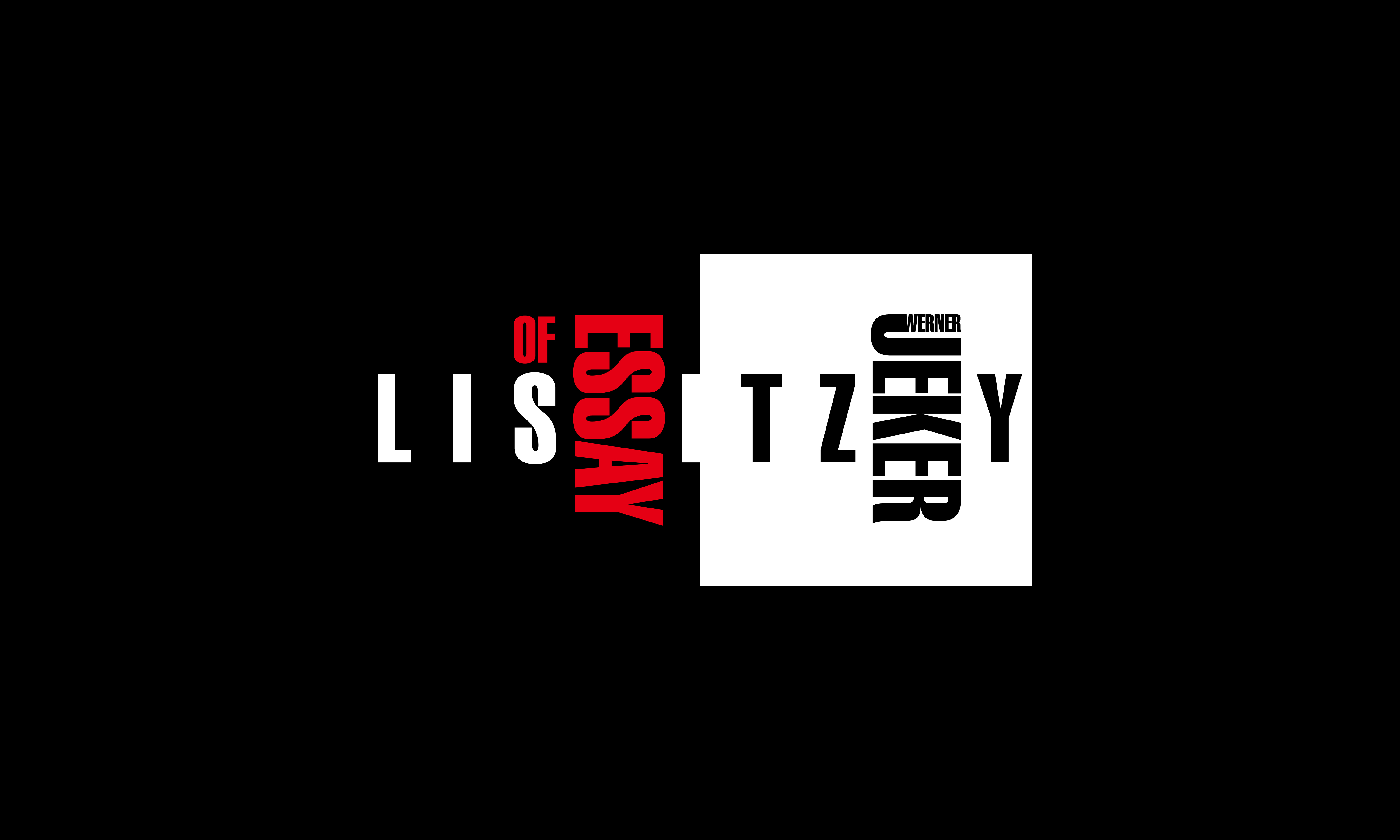
El Lissitzky And Werner Jeker
Personal Research — Fall 2020
Personal Research — Fall 2020
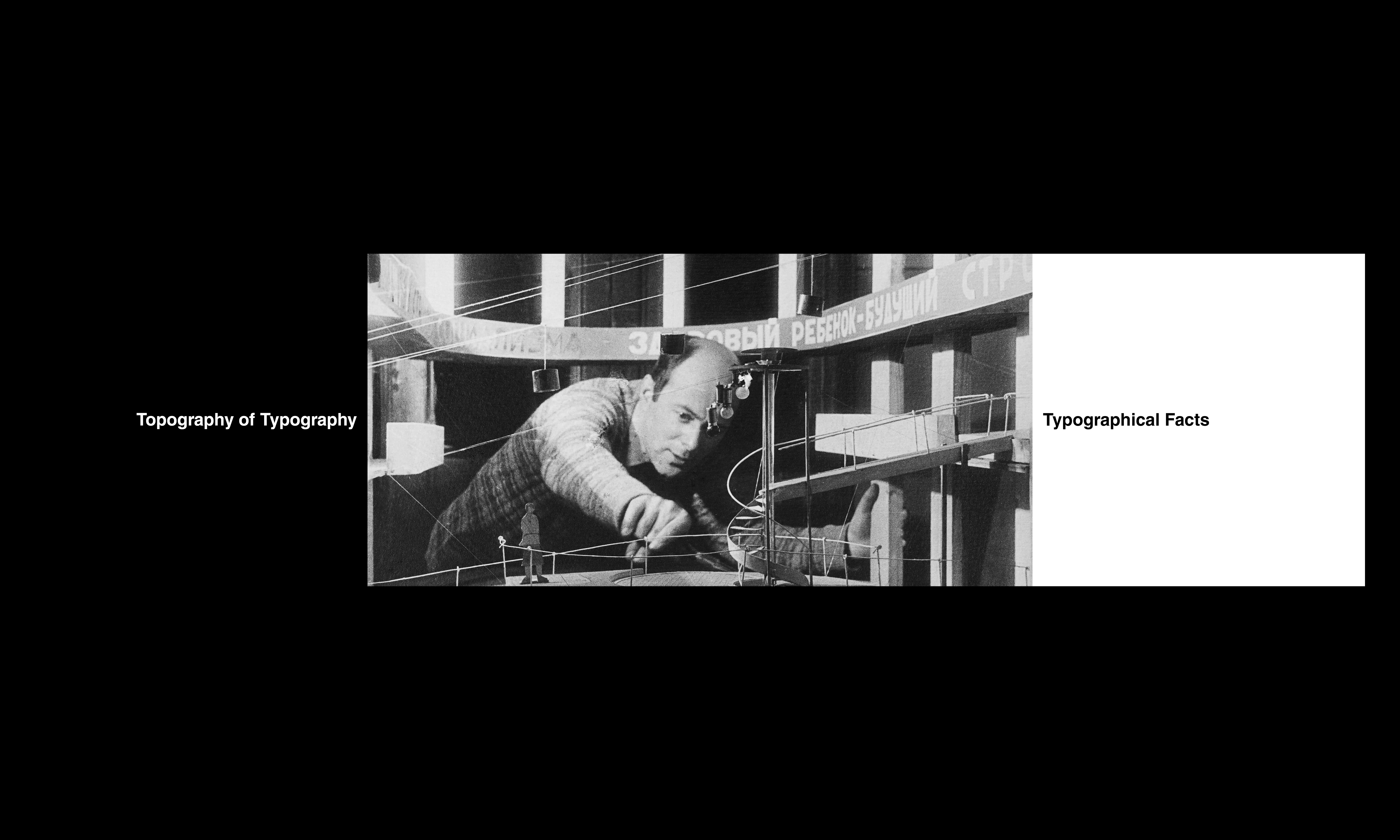
Book Design ︎︎︎ Experimental
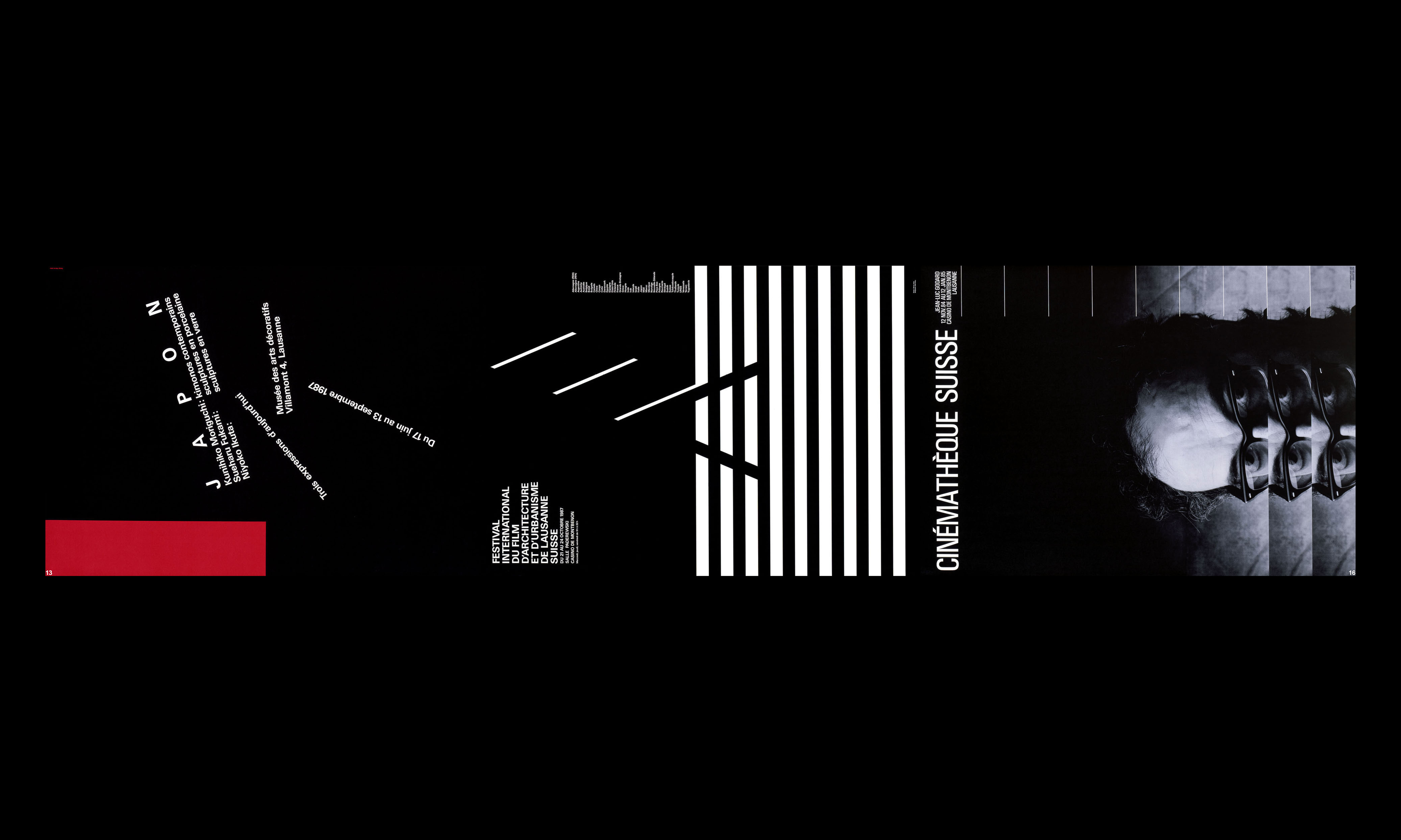
The El Lissitzky and Werner Jeker project can be considered the most fulfilling in my postgraduate period. The design brief asked us to design two El Lissitzky articles while referencing a contemporary designer’s work to bolster the article’s argument. I chose Werner Jeker, a Swiss graphic designer.
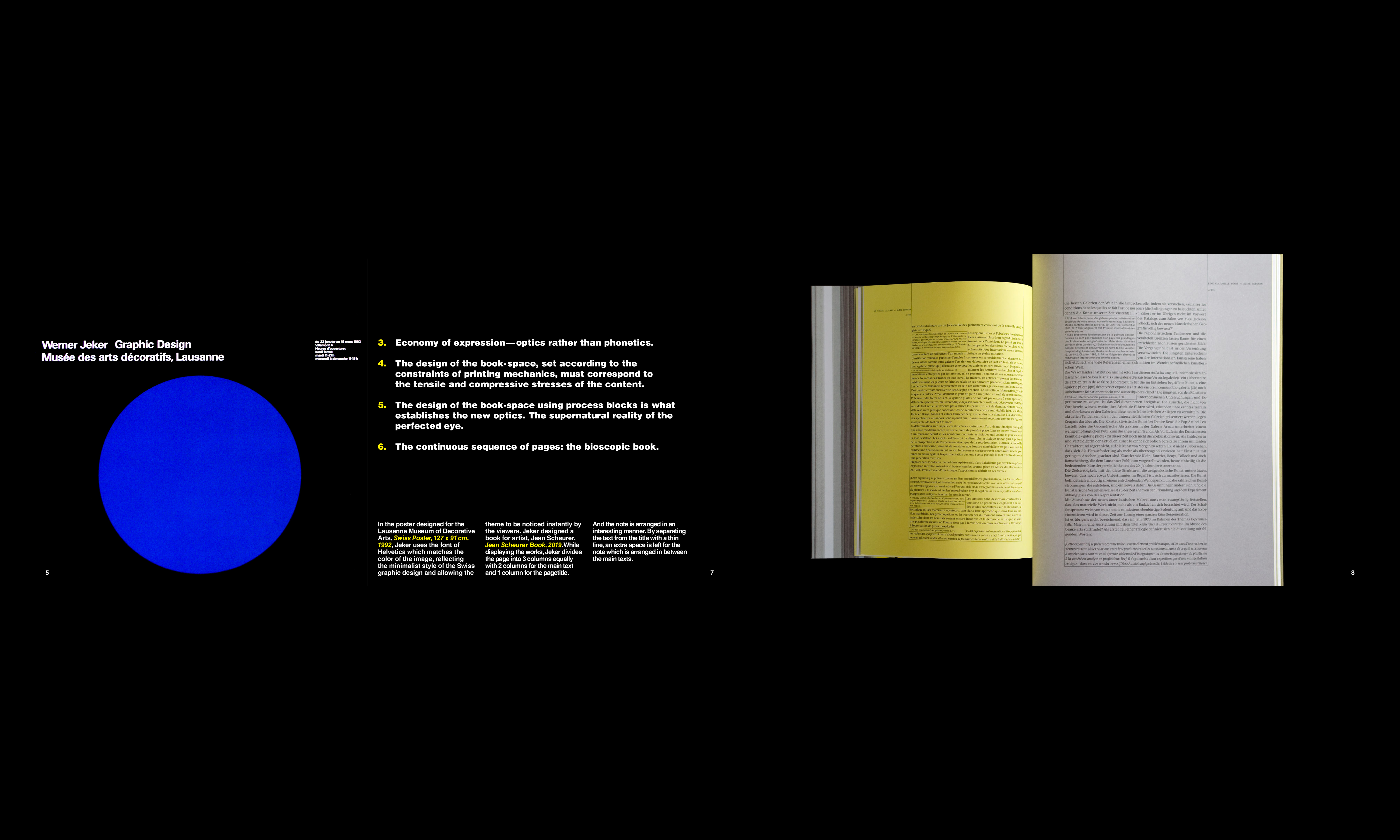
In the twentieth century, Werner Jeker was a well-known graphic designer for the Swiss. He excelled at intelligently and sophisticatedly connecting words and images. His designs are layered with varying depths and rhythms. Compared to most of his work from the 1980s and 1990s, his designs are less experimental, focusing instead on the most fundamental text and image linkages, an approach that enabled him to create art-like designs.
The most challenging aspect of this work is combining the works of the two masters and reinterpreting them through my lens. I consider myself a translator, just as Michael Rock noted in his article Designer as Author, “In certain works, the designer remolds the raw material of given content, rendering it legible to a new audience. Like the poetic translator, the designer transforms not only the literal meaning of the elements but the spirit, too.”
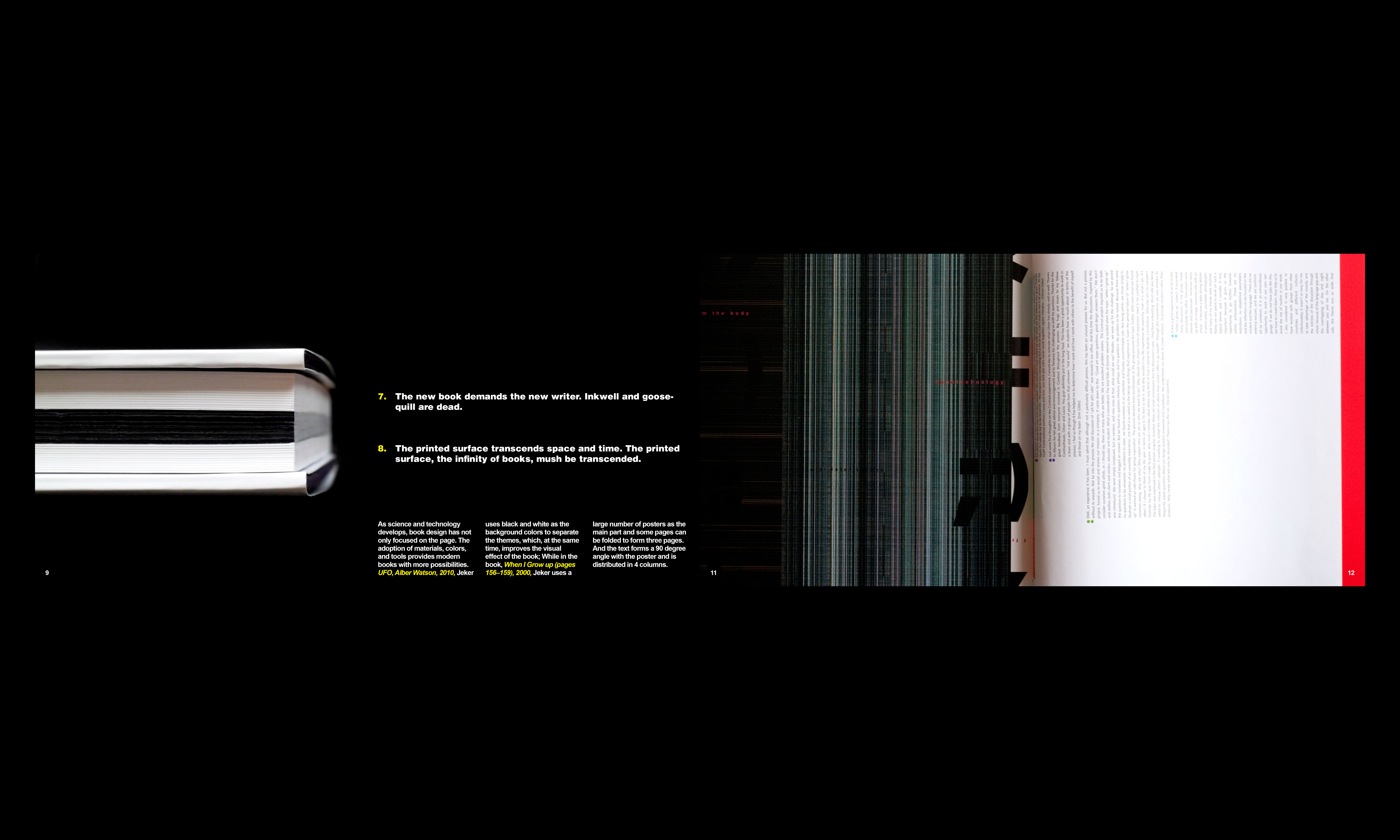
Thus, to better portray the two designers’concepts, I abandoned the traditional manner of reading and designed this magazine to be opened from the middle, allowing readers to see four pages of content at the same time. Simultaneously, the layout of each paragraph is optimized for interaction with the images. This detail reflects the concepts expressed in El Lissitzky’s paper and Werner Jeker's earlier design ideas.
The El Lissitzky and Werner Jeker project can be considered the most fulfilling in my postgraduate period. The design brief asked us to design two El Lissitzky articles while referencing a contemporary designer’s work to bolster the article’s argument. I chose Werner Jeker, a Swiss graphic designer.
In the twentieth century, Werner Jeker was a well-known graphic designer for the Swiss. He excelled at intelligently and sophisticatedly connecting words and images. His designs are layered with varying depths and rhythms. Compared to most of his work from the 1980s and 1990s, his designs are less experimental, focusing instead on the most fundamental text and image linkages, an approach that enabled him to create art-like designs.
The most challenging aspect of this work is combining the works of the two masters and reinterpreting them through my lens. I consider myself a translator, just as Michael Rock noted in his article Designer as Author, “In certain works, the designer remolds the raw material of given content, rendering it legible to a new audience. Like the poetic translator, the designer transforms not only the literal meaning of the elements but the spirit, too.”
Thus, to better portray the two designers’concepts, I abandoned the traditional manner of reading and designed this magazine to be opened from the middle, allowing readers to see four pages of content at the same time. Simultaneously, the layout of each paragraph is optimized for interaction with the images. This detail reflects the concepts expressed in El Lissitzky’s paper and Werner Jeker's earlier design ideas.