DAILY TEA
Personal Research — Fall 2020
Personal Research — Fall 2020
Branding Design ︎︎︎ Identity / Packaging
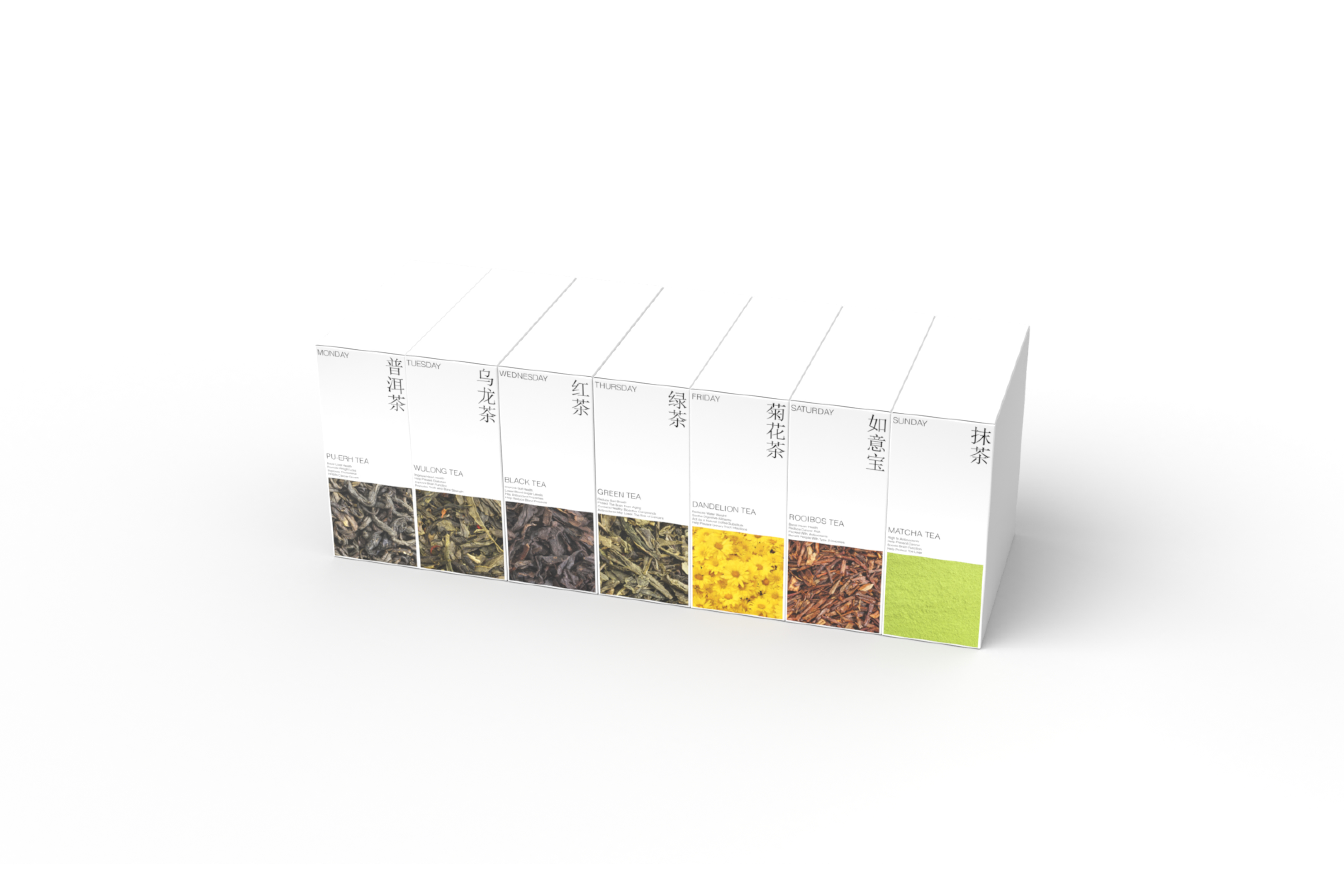
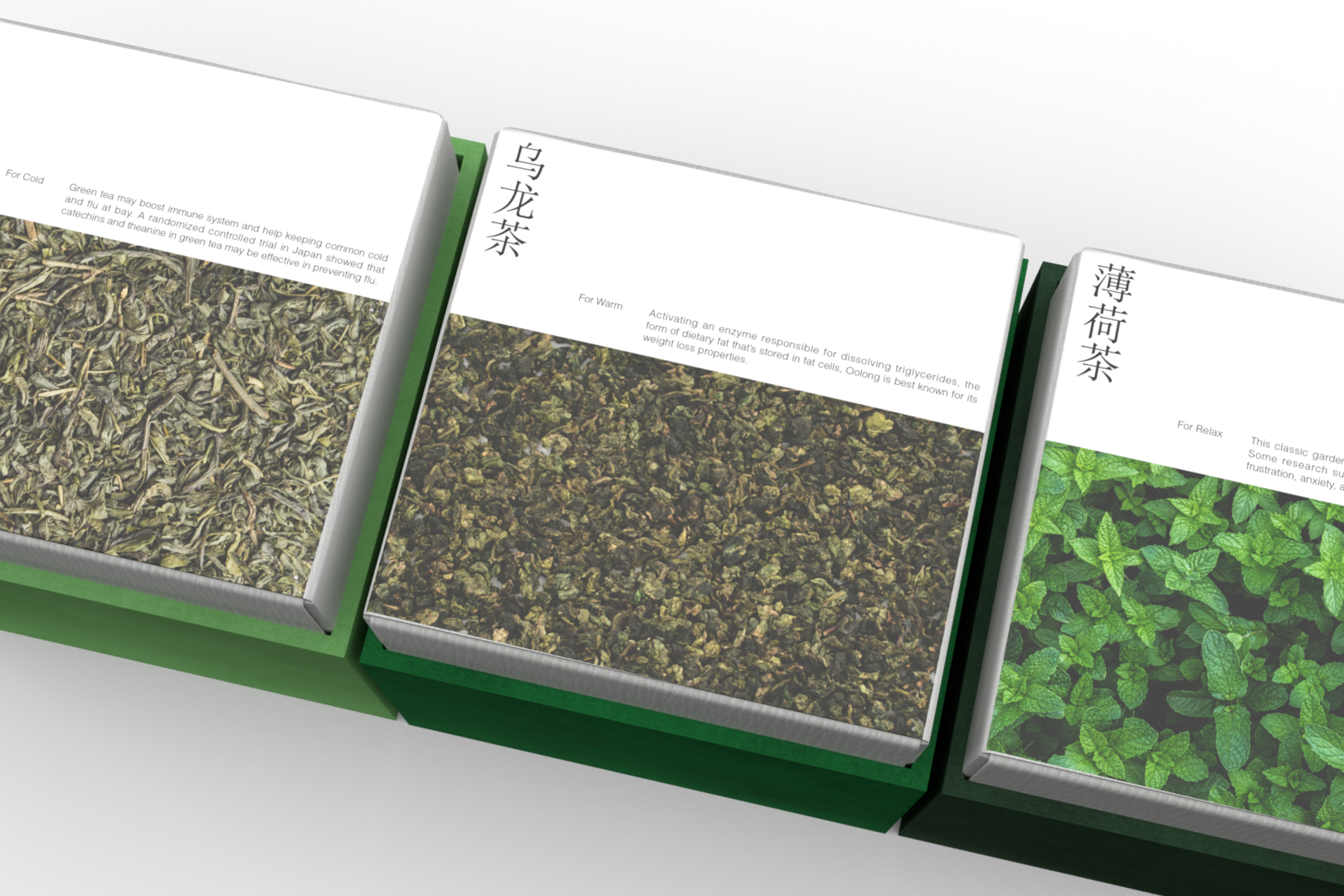
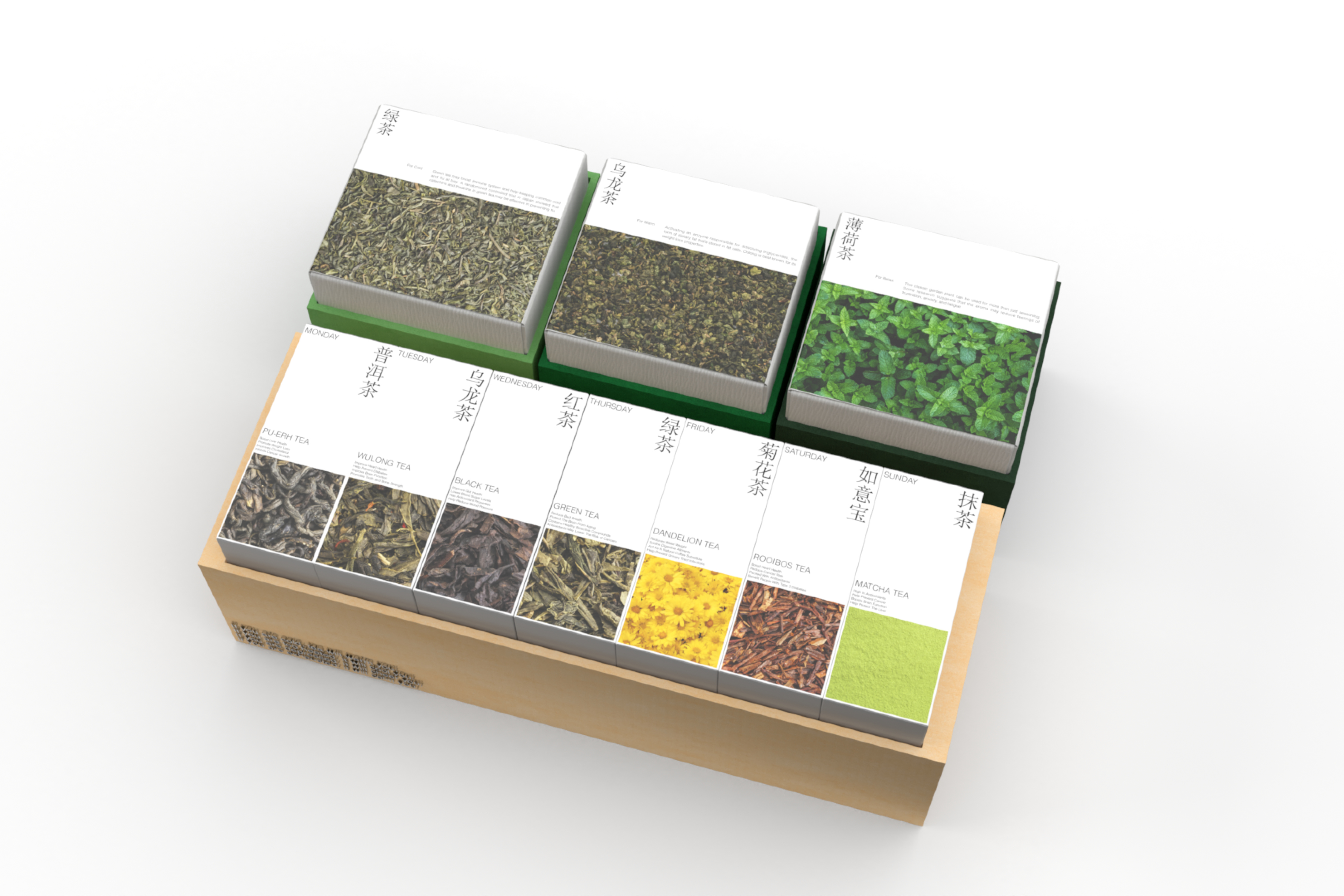
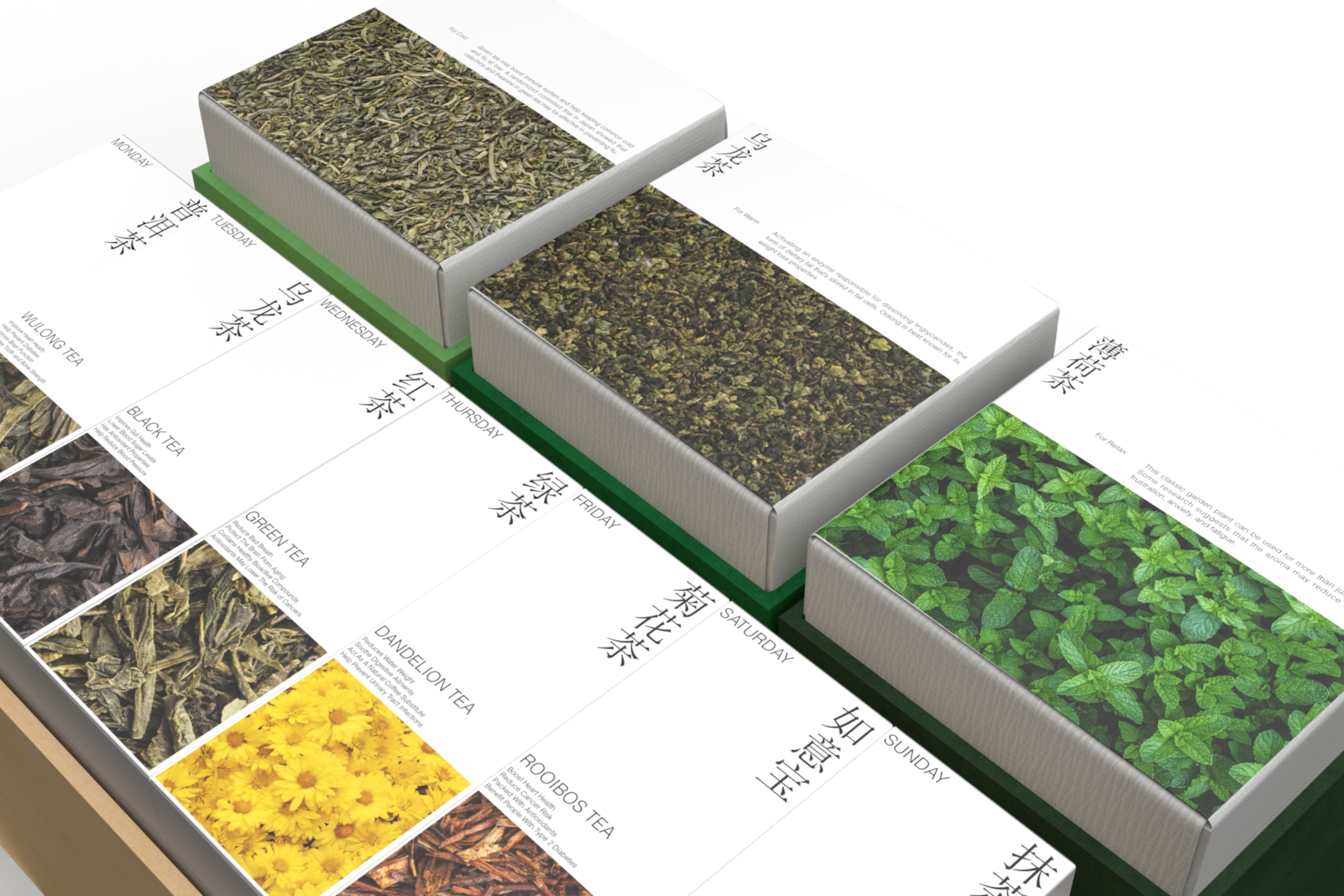
Daily Tea, a brand regarding tea as the protagonist, focuses more on the role of tea. Through a reasonable arrangement, it helps people to recognize the benefits of each type of tea for the human body in daily life. As the product is sold in multiple countries, the tea also includes elements of different cultures. In terms of identity positioning, I try to combine Chinese and Japanese styles and simplify the packaging as far as possible to highlight the tea types. Product information is printed in English sans-serif, which also reflects modern style while keeping the tradition.
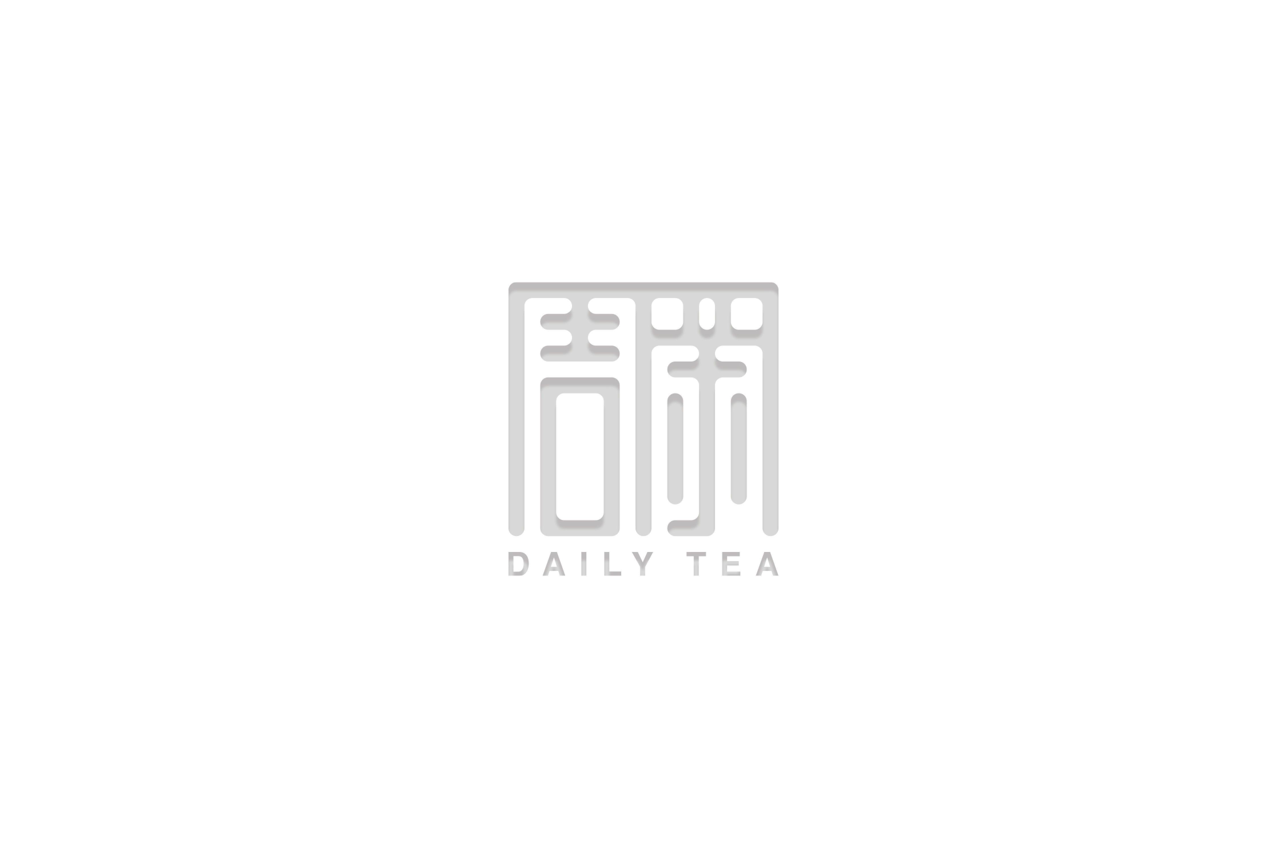
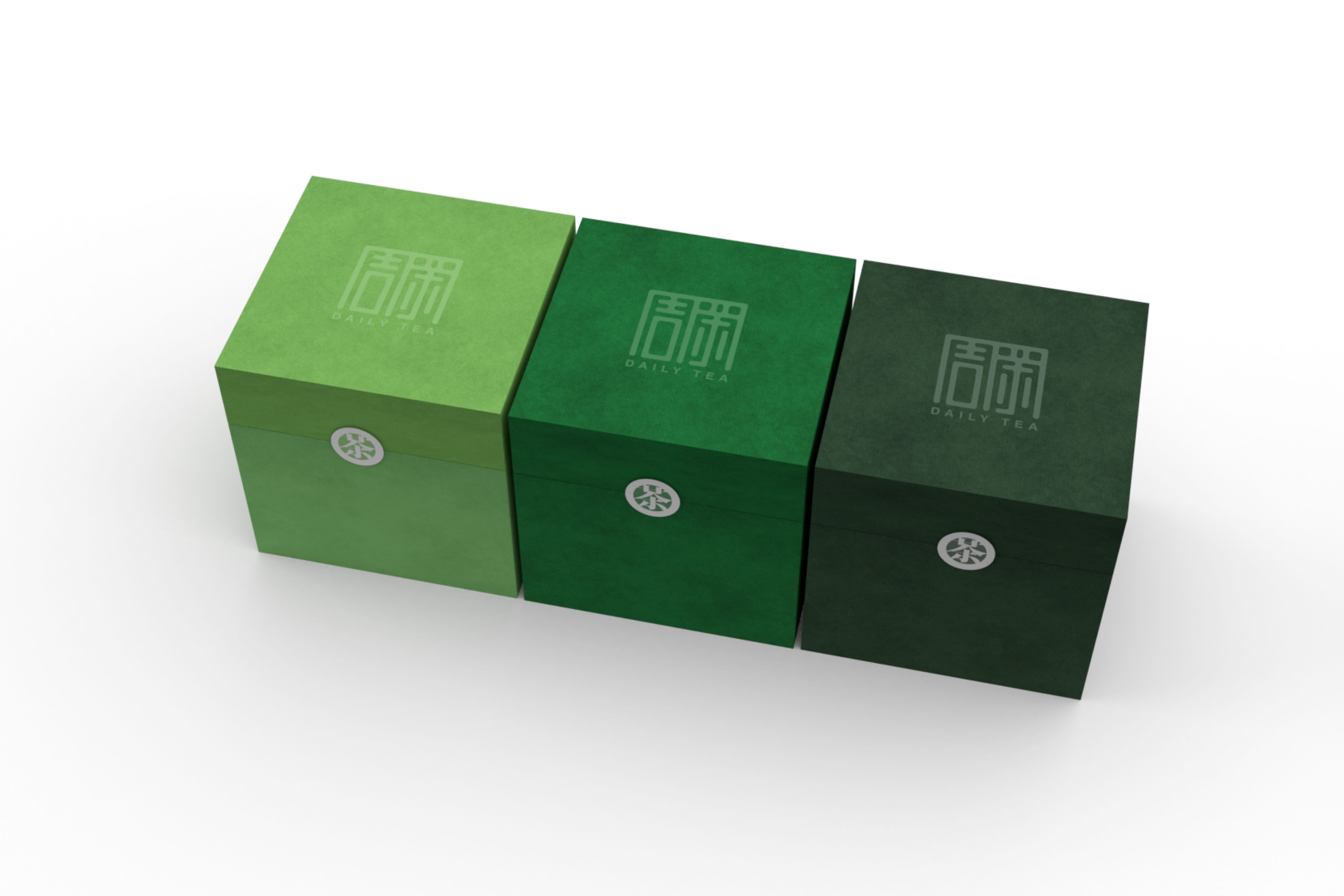
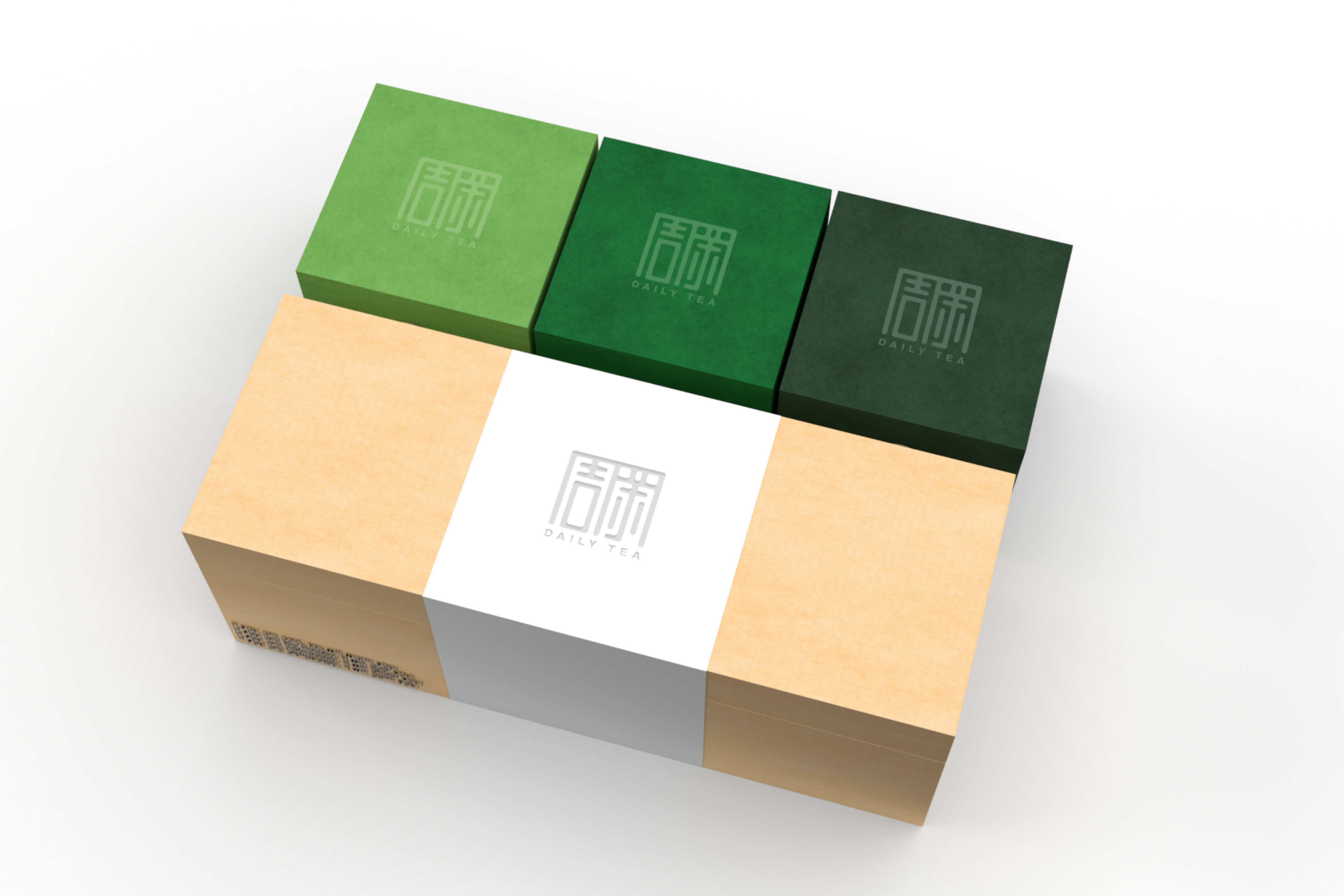
I tried to use the combination of Zhou and Cha in Chinese characters. The proportion of each Chinese character exactly matches the size of the cuboid packaging, to strengthen links between identity positioning and products. The sans-serif English font can perfectly blend with two Chinese characters, and allow customers to have a clear understanding of the product. After that, I got inspiration from the family mon from Japanese culture, so I extracted the word "tea" and designed the crest for the product.
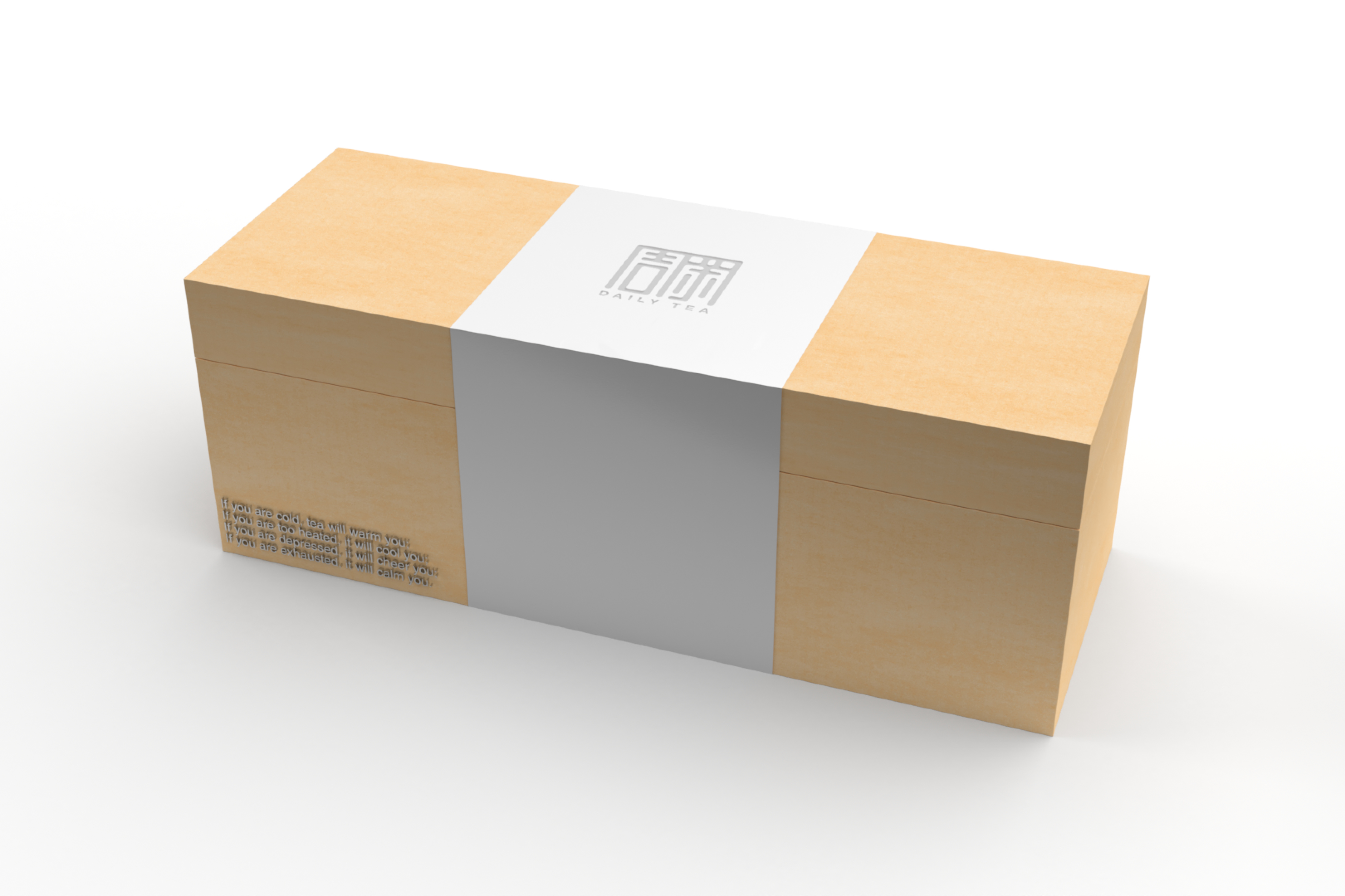
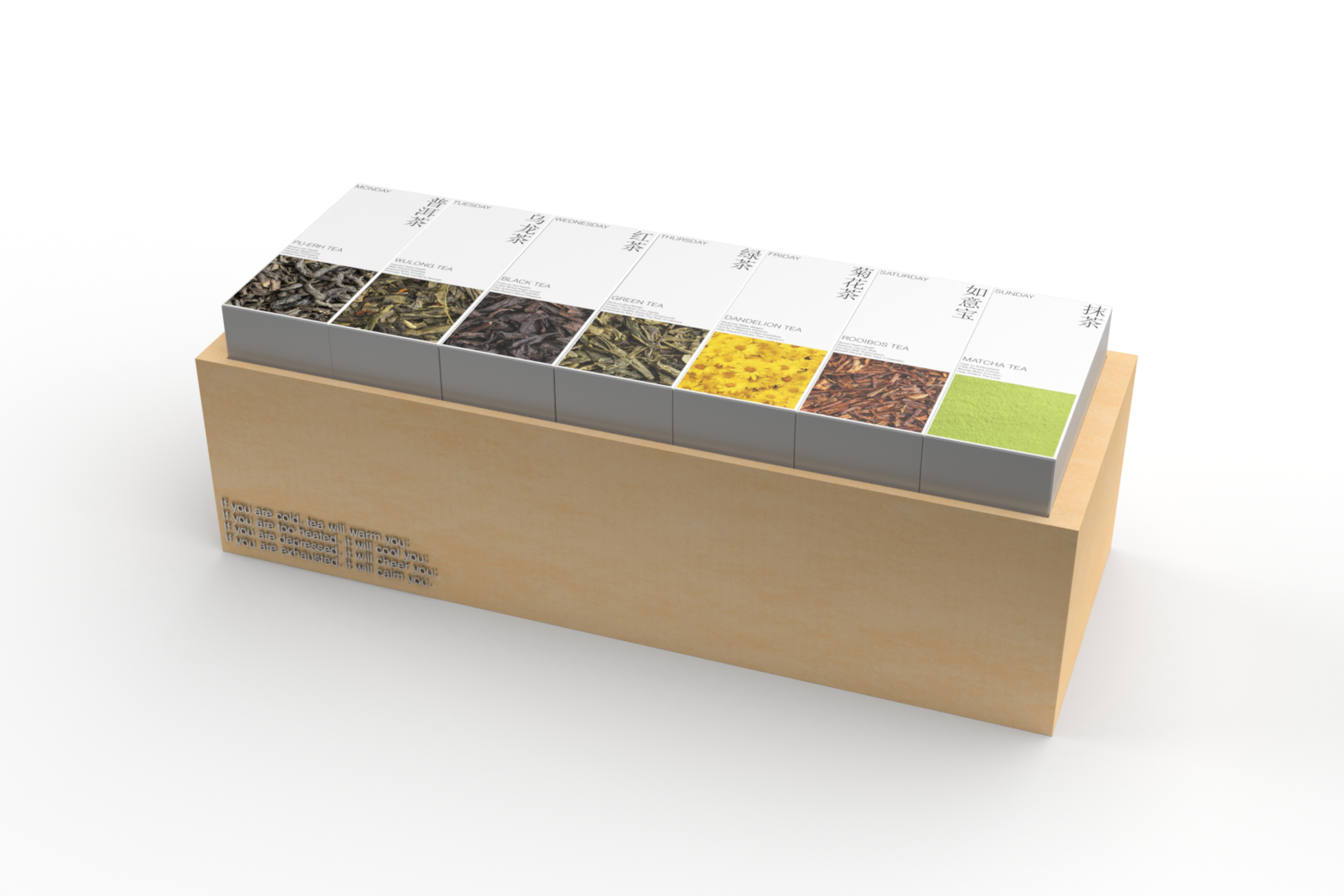
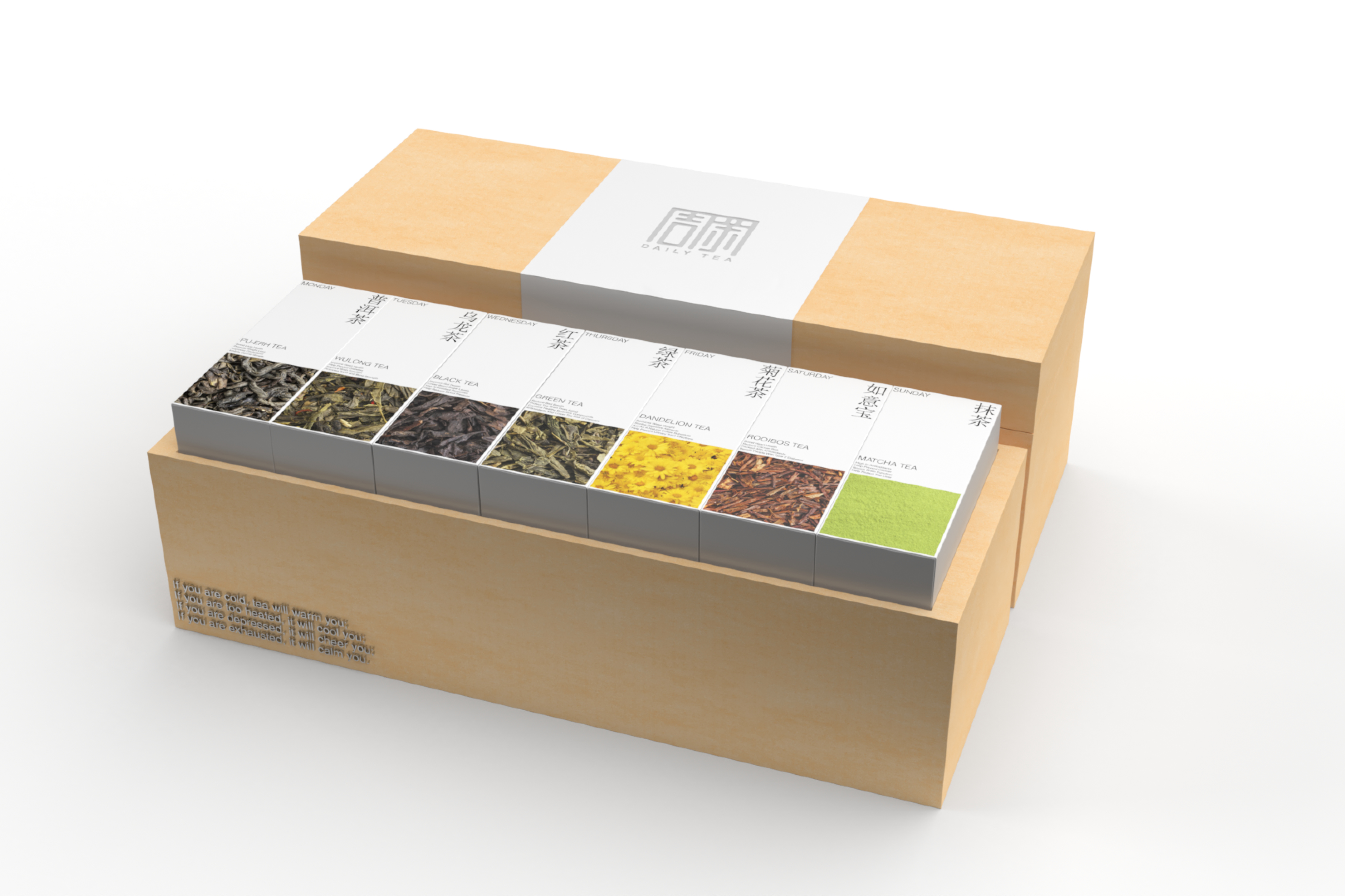
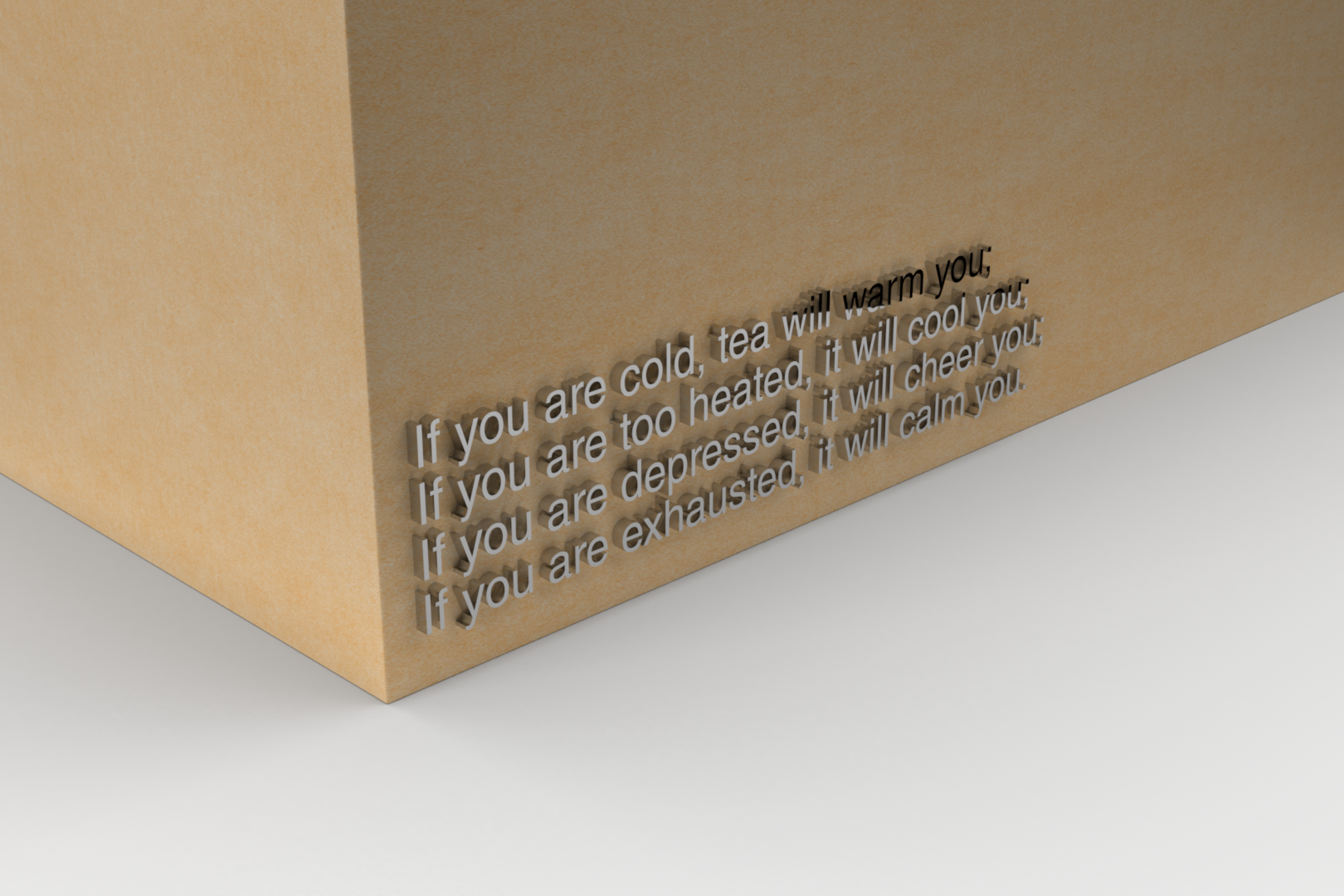
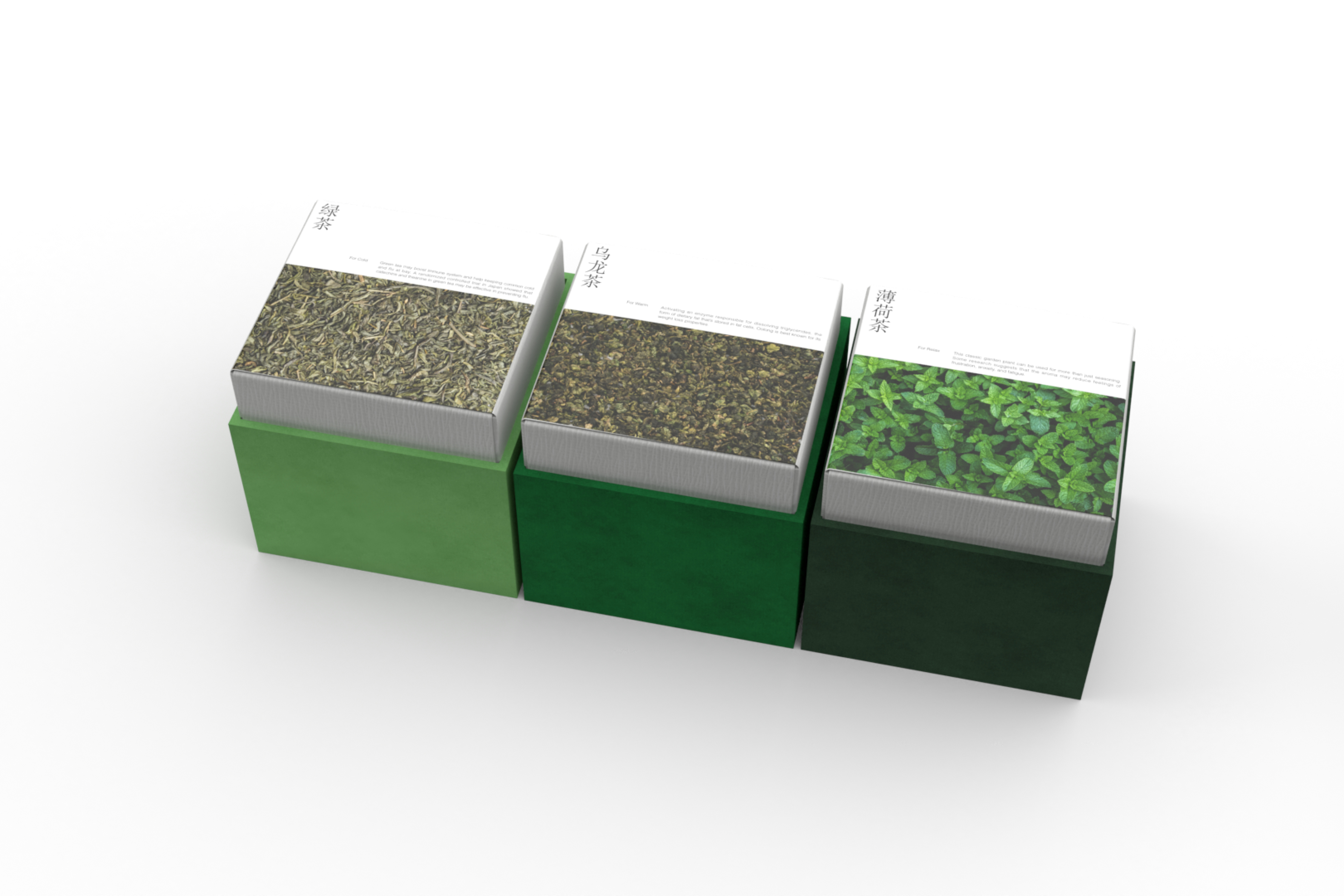
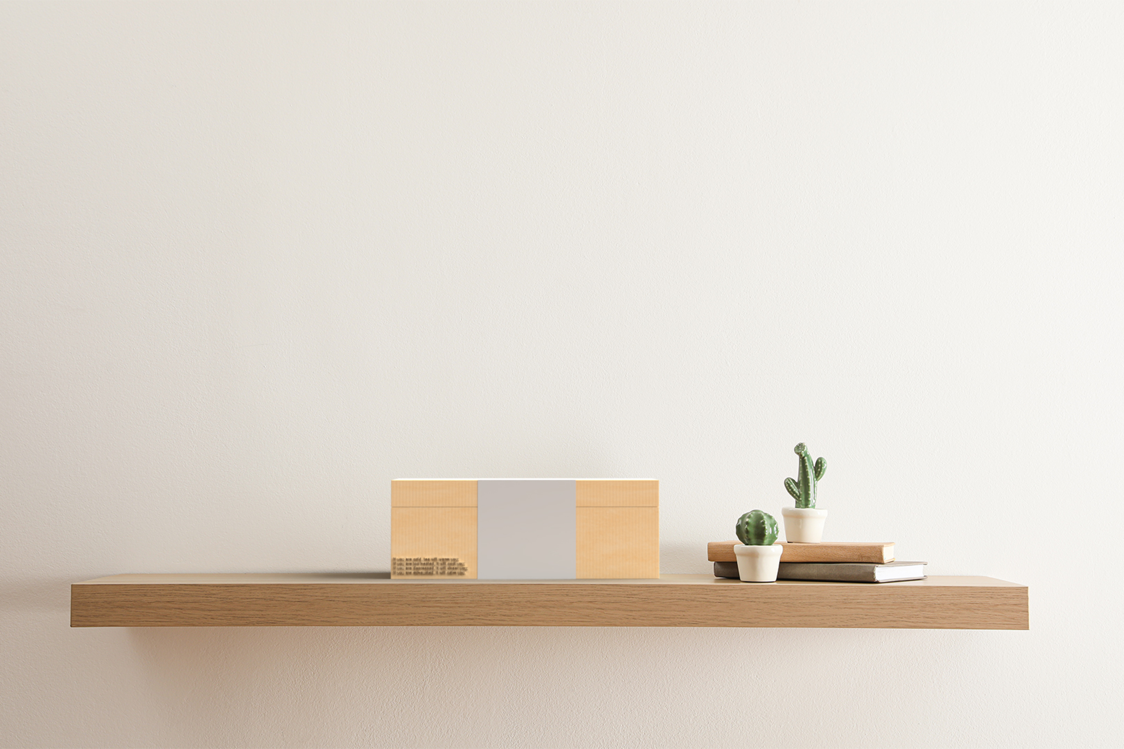
The packaging design of the main tea box and the single-product tea box is in the same open mode. The wooden box is used as a container, which protects the tea, and can also be used as a container to store other things. In terms of color selection, the main tea box is brighter and more delicate, and it blends with the white wrapping paper, making it more comfortable in appearance. The tea boxes of single products are distinguished by different green colors to ensure that customers have a better understanding of the effects of each tea when making a selection. In terms of details, a short sentence about tea is recorded on the front of the main tea box to fit the main theme of the product.
