MOIRÉ TYPEFACE
Personal Research — Fall 2021
Personal Research — Fall 2021
Type Design ︎︎︎ Experimental
Moiré typeface is an experimental typeface design that hovers between the visible and invisible.
Since I exploring the moiré effect in the Alienation project, I continued to look for ways to apply this technique to different fields. Moiré patterns are large-scale interference patterns that can be produced when an opaque ruled pattern with transparent gaps is overlaid on another similar pattern. However, as moiré patterns also require physical interaction to take shape. I was determined to also apply this effect to static typeface in digital form.
When we choose a font for our daily work, whether or not we’re designers, its functions are frequently centered on ornamentation and readability. Different typefaces convey various information and images, educational levels, and experience. However, to integrate moiré qualities, I weakened the typeface’s overall character and made it more reactive. As a result, this font will not be used passively in the content but will be a variable typeface available for use on a digital platform.
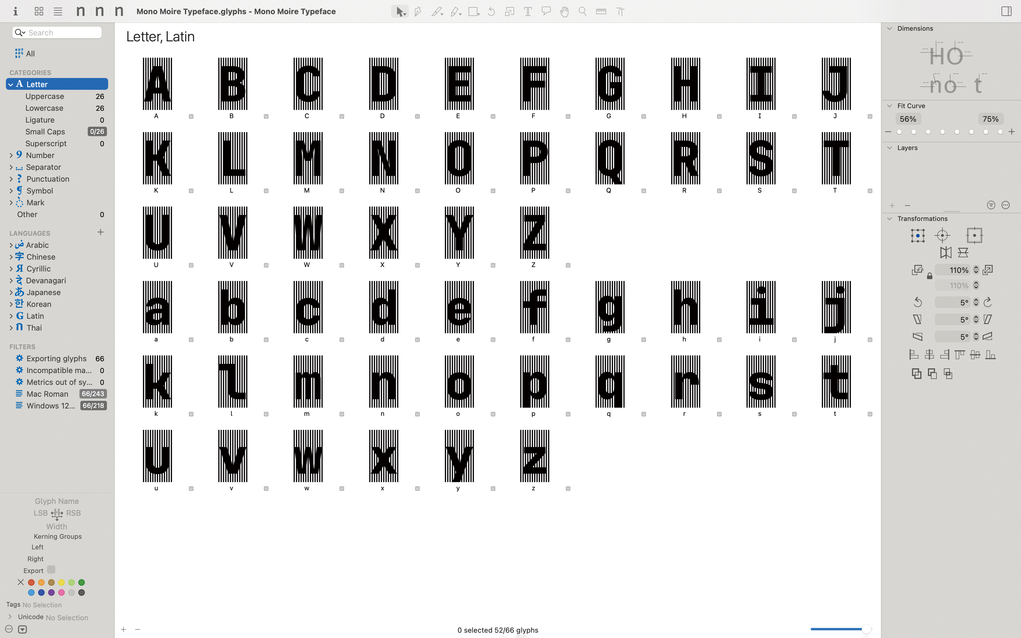
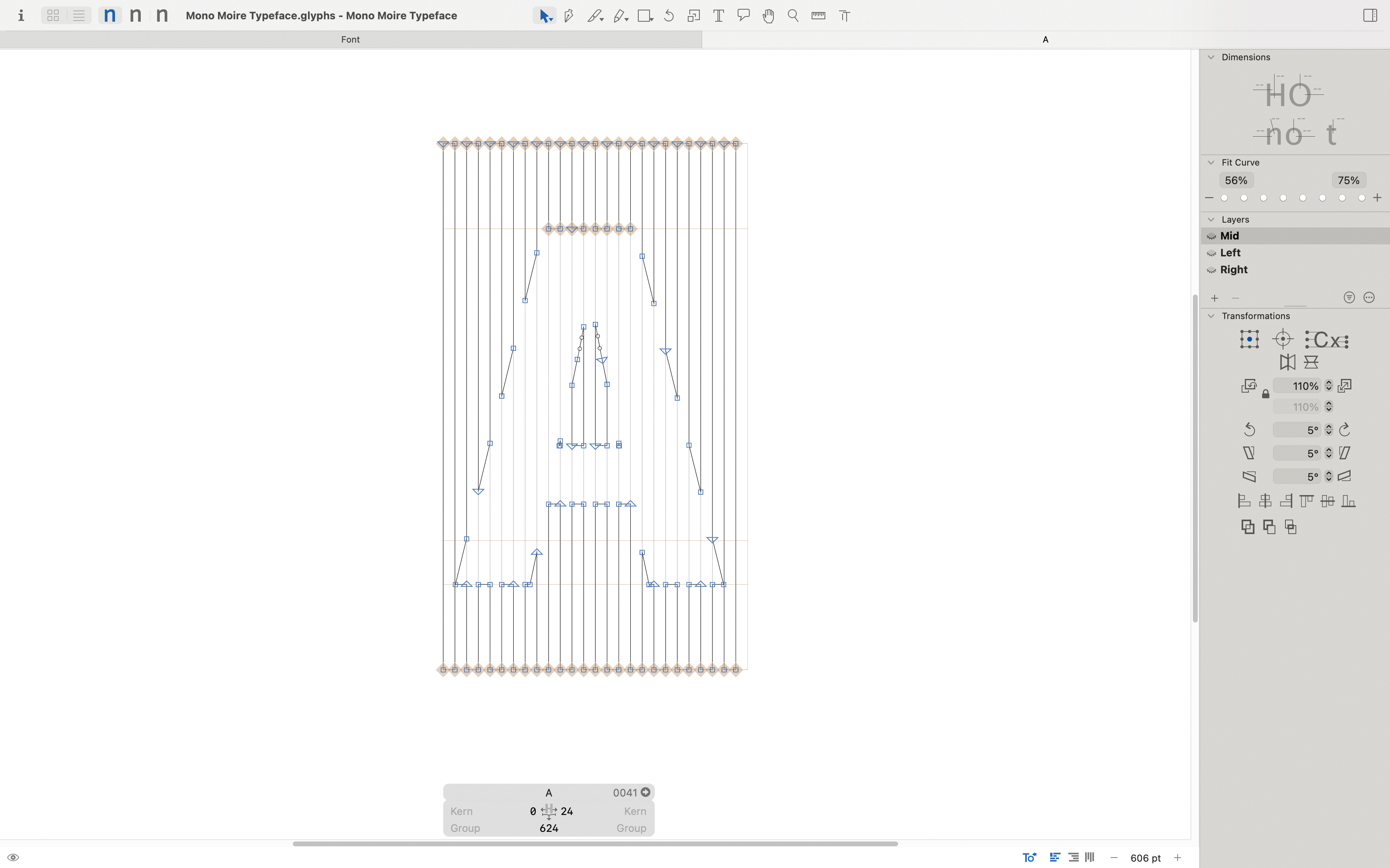
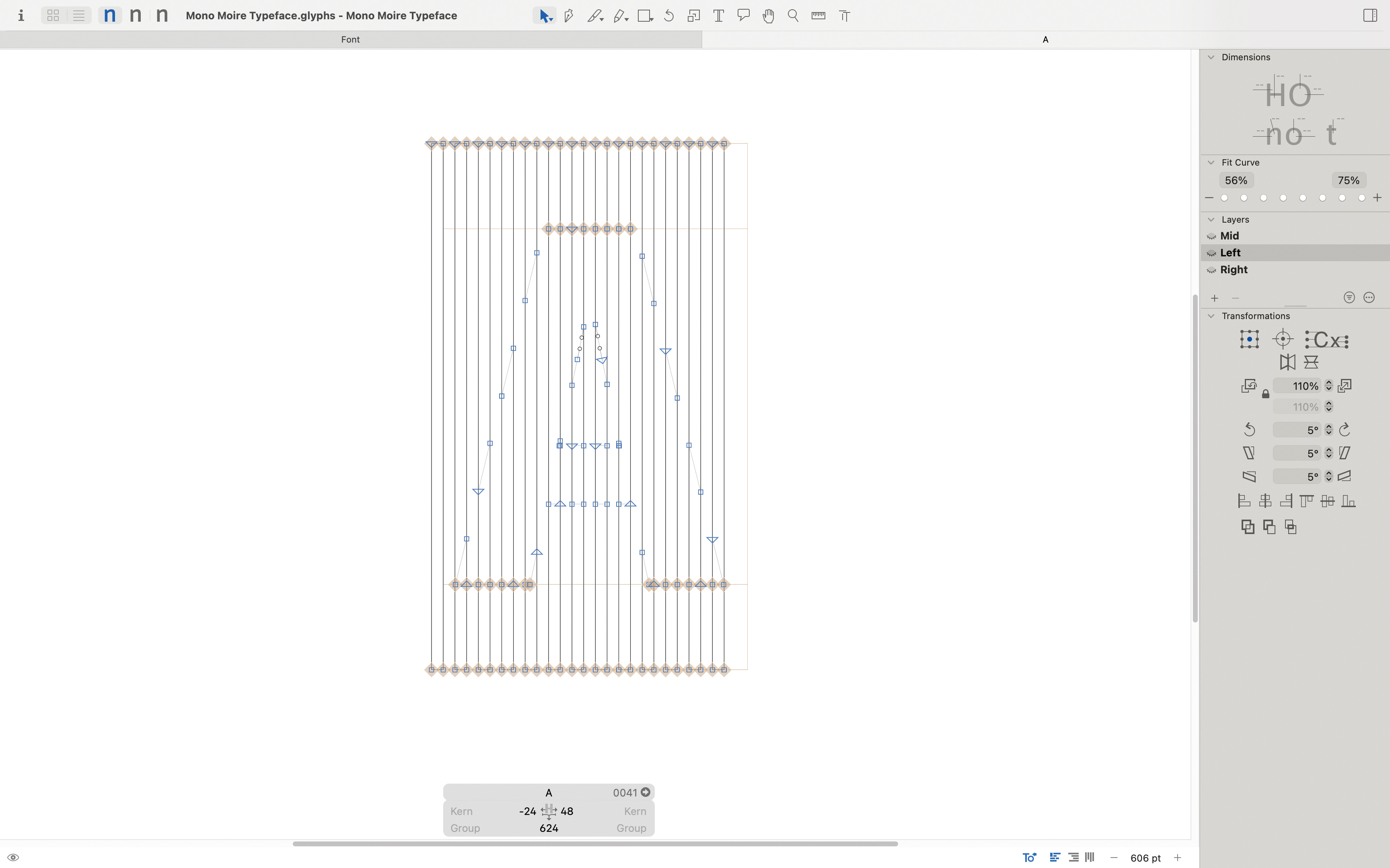
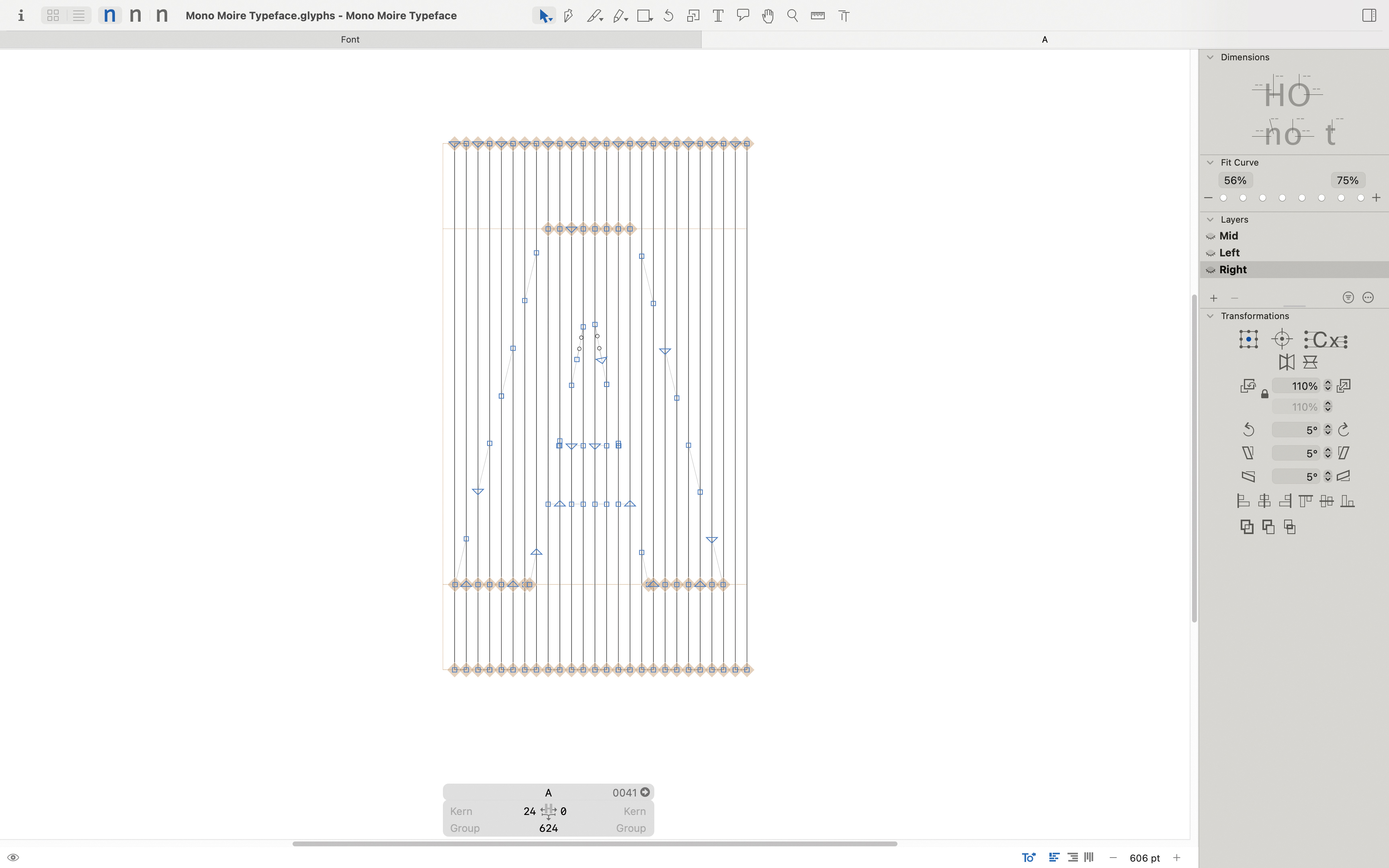
I created two layers with the Glyphs software; the first layer is a pattern of various rectangles, and the second layer consists of moiréed letters. When the pattern on the first layer moves consistently left and right, the letters on the second layer will occasionally appear and disappear. Users must interact with the digital platform to realize the text's visible and unseen states.
This typeface introduces a new level of interaction between users and typefaces. It not only translates moiré patterns to digital forms on a physical level but also vanishes, similarly to our parallax, challenging users’ capacity to capture information. This mode of interaction, in my opinion, serves as a metaphor: If you want to perceive something differently, shift your perspective.
Moiré typeface is an experimental typeface design that hovers between the visible and invisible.
Since I exploring the moiré effect in the Alienation project, I continued to look for ways to apply this technique to different fields. Moiré patterns are large-scale interference patterns that can be produced when an opaque ruled pattern with transparent gaps is overlaid on another similar pattern. However, as moiré patterns also require physical interaction to take shape. I was determined to also apply this effect to static typeface in digital form.
When we choose a font for our daily work, whether or not we’re designers, its functions are frequently centered on ornamentation and readability. Different typefaces convey various information and images, educational levels, and experience. However, to integrate moiré qualities, I weakened the typeface’s overall character and made it more reactive. As a result, this font will not be used passively in the content but will be a variable typeface available for use on a digital platform.
I created two layers with the Glyphs software; the first layer is a pattern of various rectangles, and the second layer consists of moiréed letters. When the pattern on the first layer moves consistently left and right, the letters on the second layer will occasionally appear and disappear. Users must interact with the digital platform to realize the text's visible and unseen states.
This typeface introduces a new level of interaction between users and typefaces. It not only translates moiré patterns to digital forms on a physical level but also vanishes, similarly to our parallax, challenging users’ capacity to capture information. This mode of interaction, in my opinion, serves as a metaphor: If you want to perceive something differently, shift your perspective.