MELATONIN GUMMIES
Personal Research — Fall 2020
Personal Research — Fall 2020
Branding Design ︎︎︎ Packaging
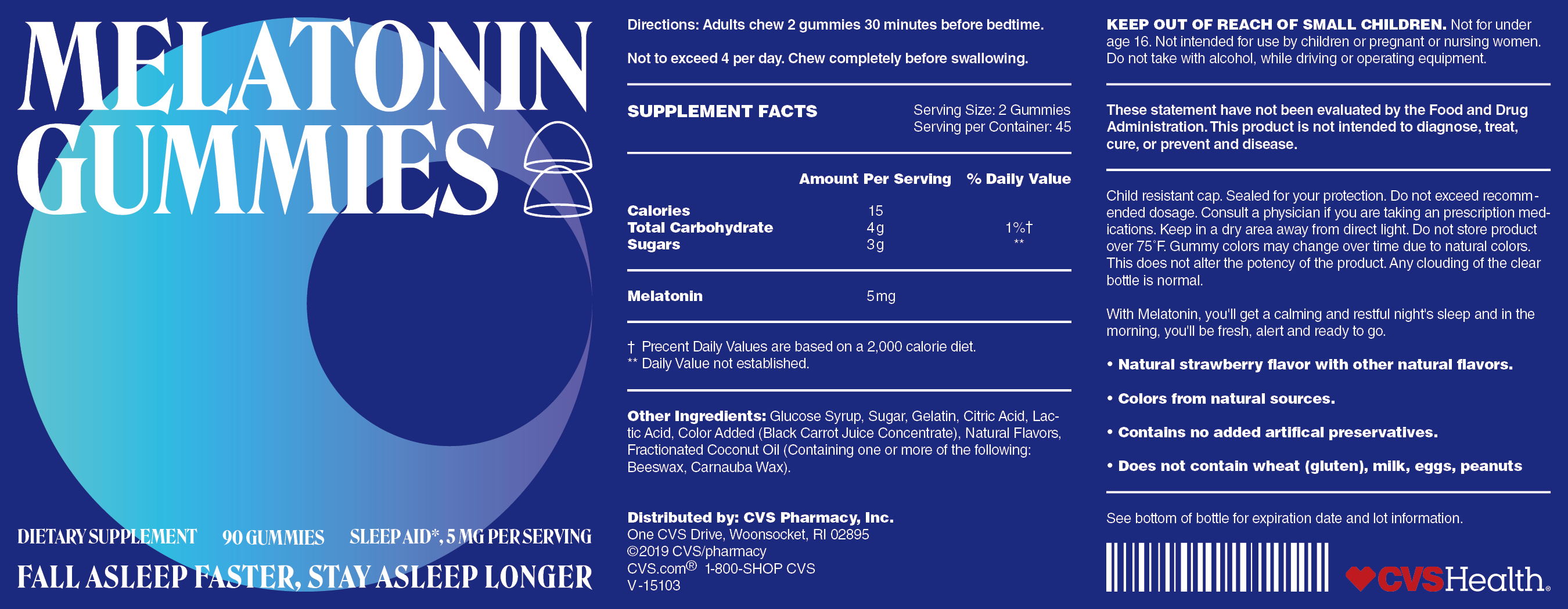
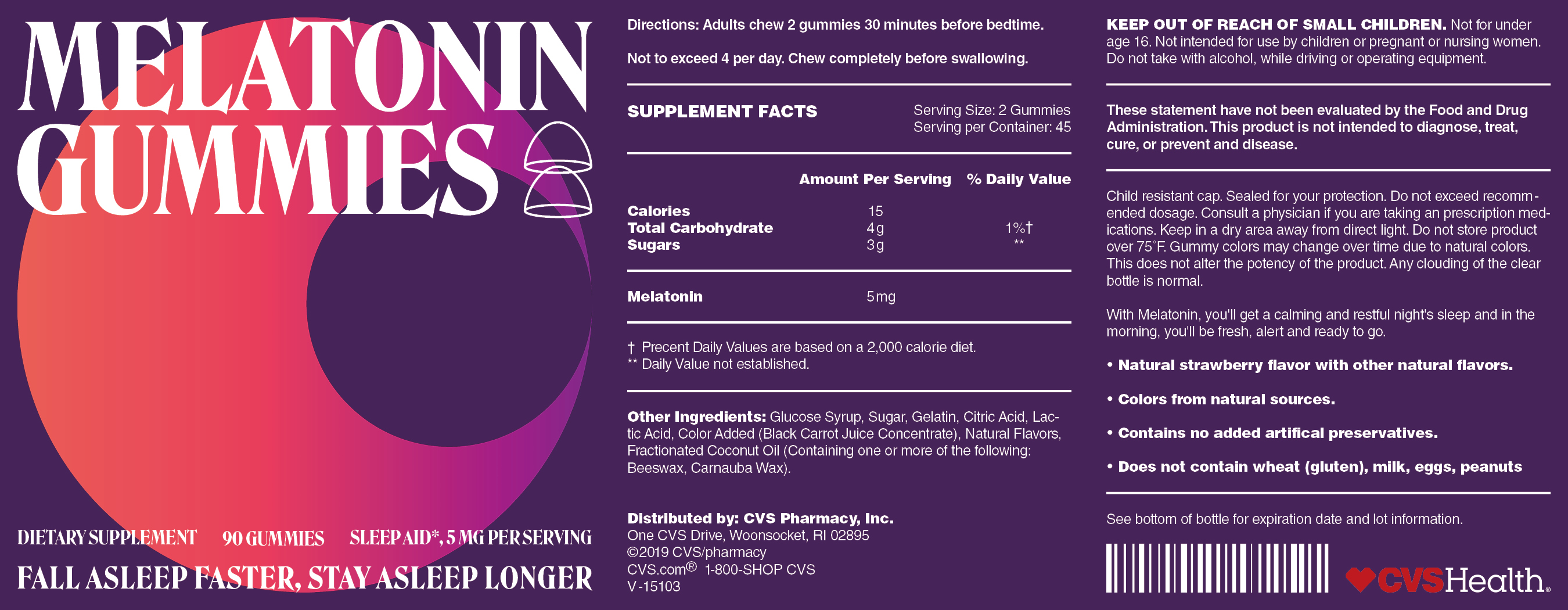
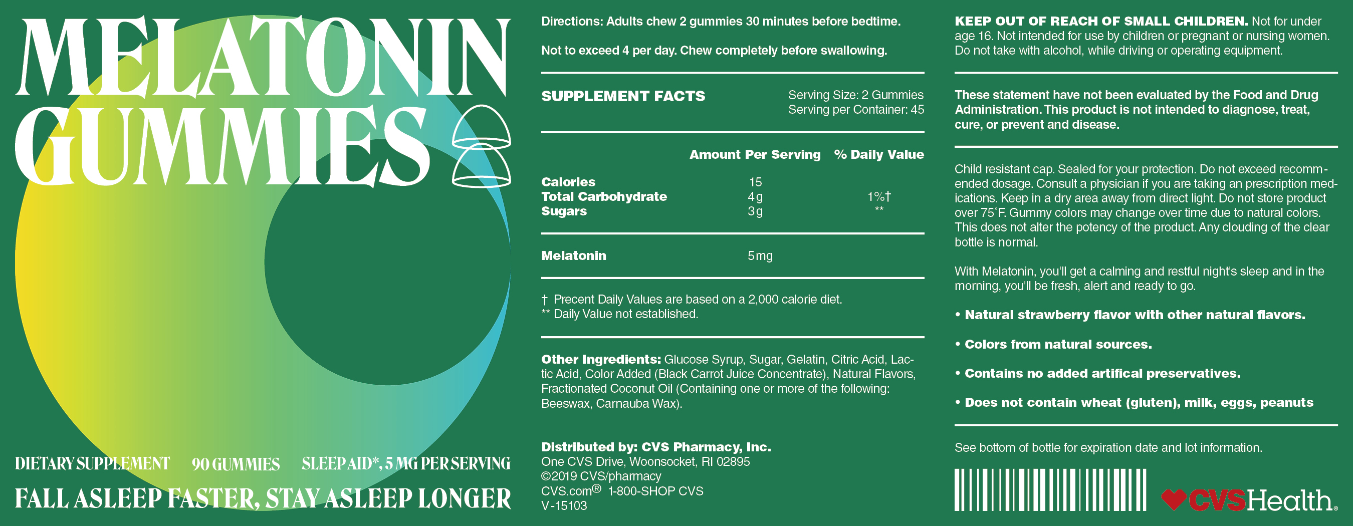
I have suffered unstable sleeping quality problems with toiling academic loads as I get older, so I got a bottle of melatonin ready in front of the table. But as a customer, I find it difficult to make a choice in front of melatonin of varying varies on offer in the current marketplace, some brands of which give me a poor user experience as it would fall off gradually as you apply it due to botched efforts of the packaging paper of some brands to stay fixed to the surface of the container. After comparing a series of products of the same ilk, I reckon that CVS melatonin can be considered one of the best products on offer in the marketplace in terms of effects and qualities despite its shortage of visual impacts somewhat.
In 2014, CVS re-designed the logo by scheduling to present itself as a brand new healthy and secured identity to the masses with taking cancellation of sales of tobacco as the springboard. Thanks to the gradual application of a flattened logo design to all of its products, a terse and succinct matching of colors, and a reasonable layout of information, it becomes the first pick for the public. But for melatonin series products, CVS is yet to show a superb package design. In the vision, it is challenging for users to tell the primary from the secondary at first glance as arduous product information is concentrated in the cover. As its logo and the overall design is way too imposing, they do not seem to match up in a vision.
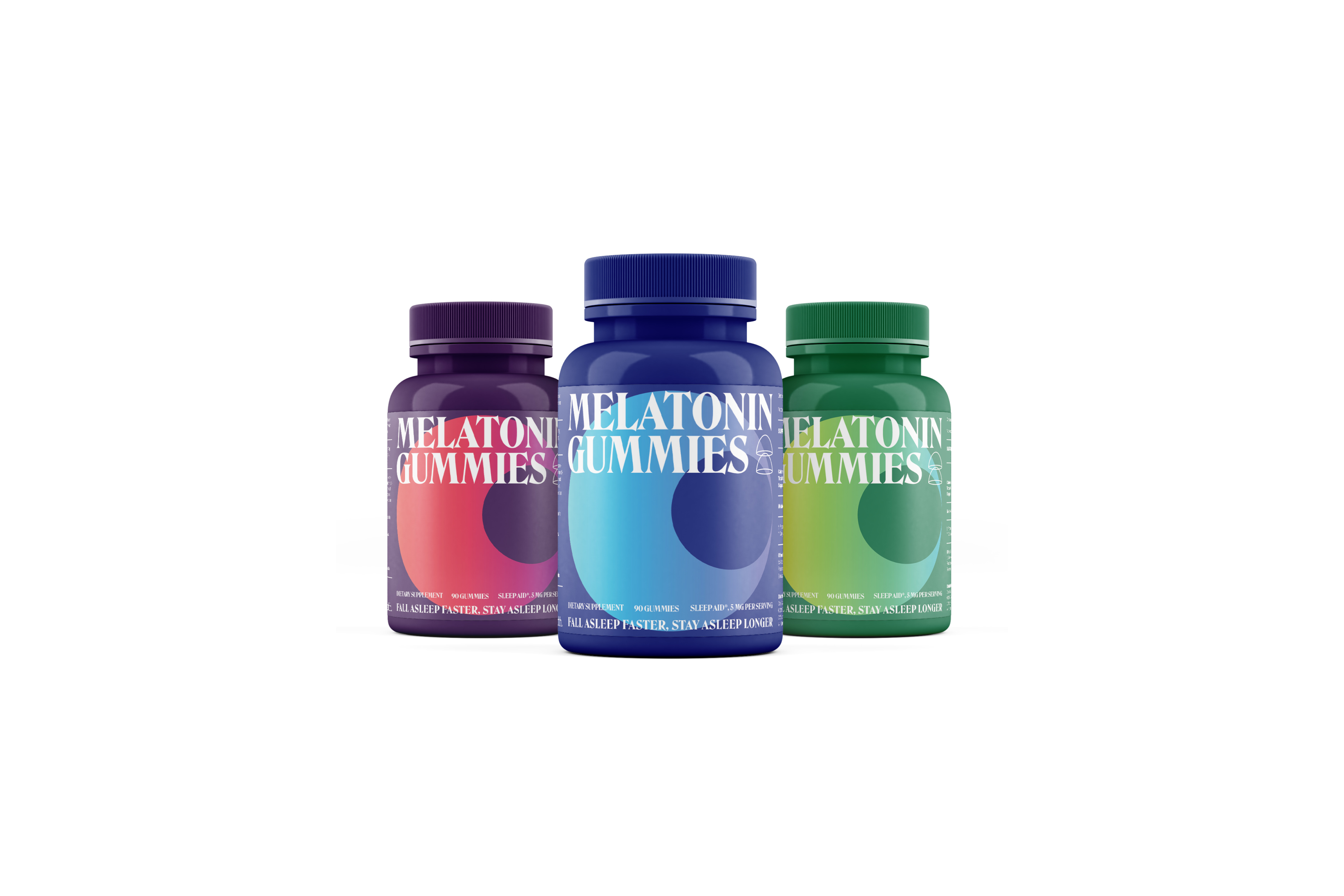
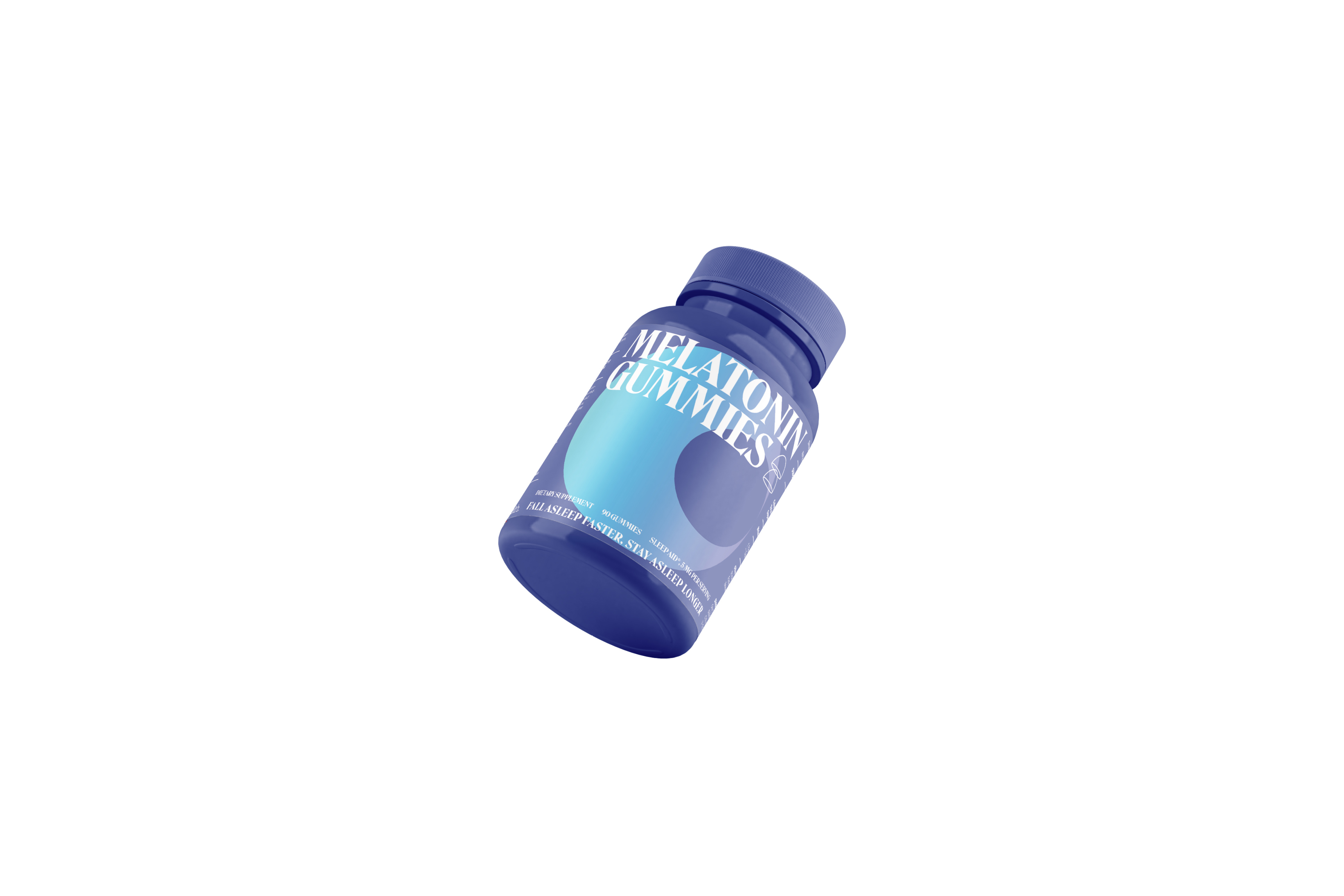
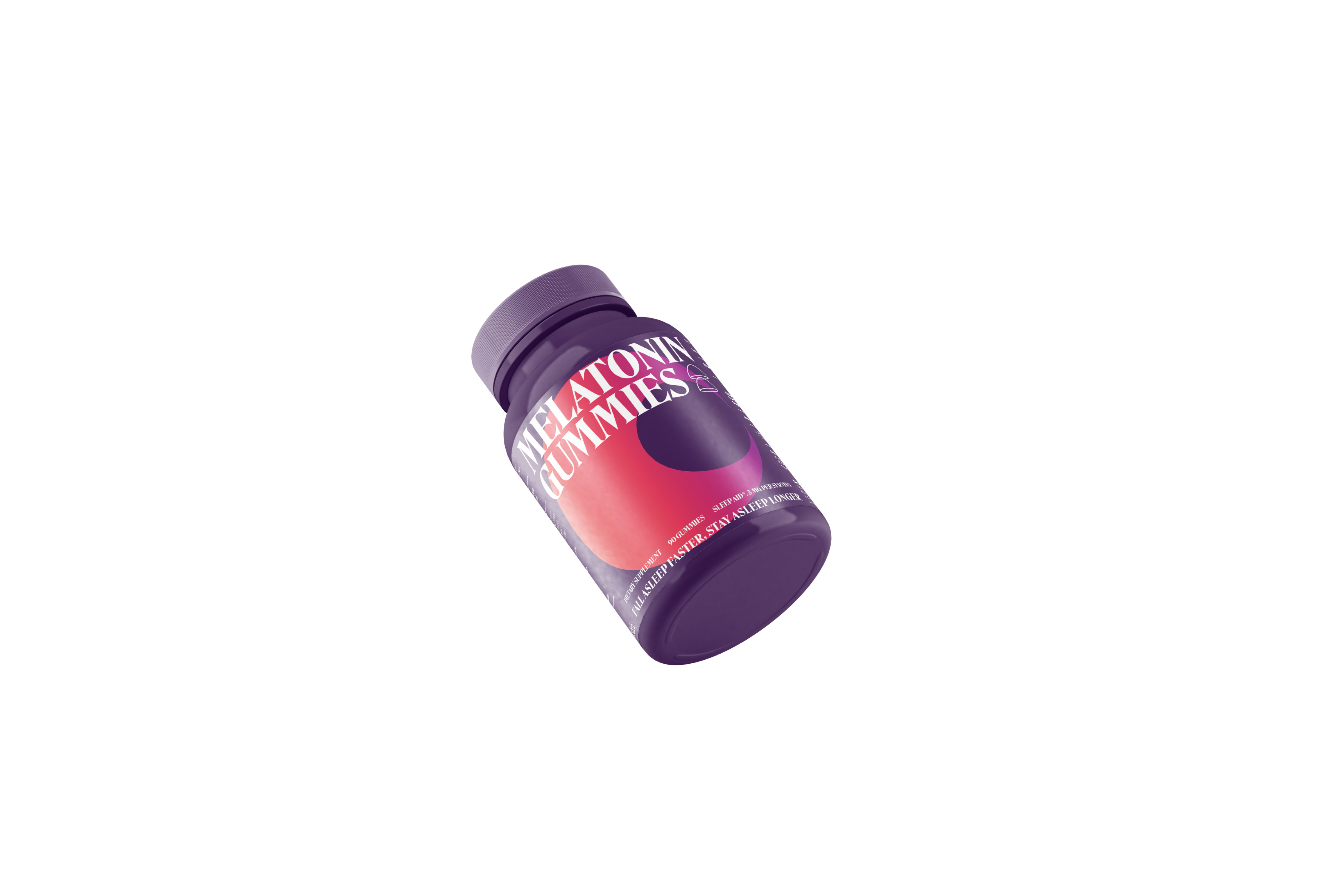
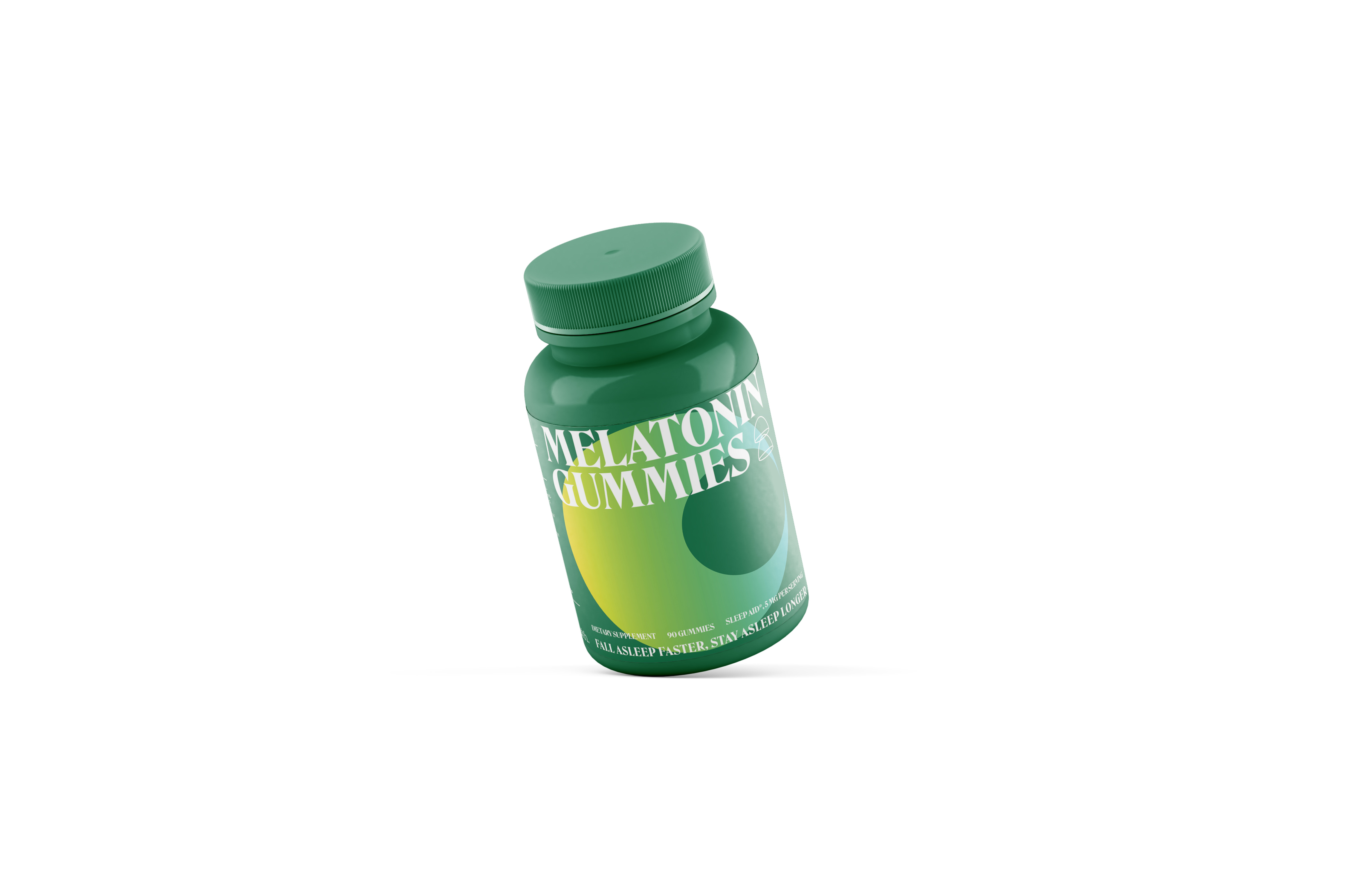
So other than maintaining the identity of CVS, I would focus most of our attention on cover design. As it is about sleep, I avert bright colors in the selection of hues so that the dull color background would intuitively help associate more with sleep. With the gradient change in the moon and the contour designing of melatonin, its entirety would comply with the flattening sense of CVS. The package is added with more diversity with the serif font and the non-serif font in combination. To boot, the overall color would shift with varying flavors so that the singular melatonin of CVS can form a series of products.
I have suffered unstable sleeping quality problems with toiling academic loads as I get older, so I got a bottle of melatonin ready in front of the table. But as a customer, I find it difficult to make a choice in front of melatonin of varying varies on offer in the current marketplace, some brands of which give me a poor user experience as it would fall off gradually as you apply it due to botched efforts of the packaging paper of some brands to stay fixed to the surface of the container. After comparing a series of products of the same ilk, I reckon that CVS melatonin can be considered one of the best products on offer in the marketplace in terms of effects and qualities despite its shortage of visual impacts somewhat.
In 2014, CVS re-designed the logo by scheduling to present itself as a brand new healthy and secured identity to the masses with taking cancellation of sales of tobacco as the springboard. Thanks to the gradual application of a flattened logo design to all of its products, a terse and succinct matching of colors, and a reasonable layout of information, it becomes the first pick for the public. But for melatonin series products, CVS is yet to show a superb package design. In the vision, it is challenging for users to tell the primary from the secondary at first glance as arduous product information is concentrated in the cover. As its logo and the overall design is way too imposing, they do not seem to match up in a vision.
So other than maintaining the identity of CVS, I would focus most of our attention on cover design. As it is about sleep, I avert bright colors in the selection of hues so that the dull color background would intuitively help associate more with sleep. With the gradient change in the moon and the contour designing of melatonin, its entirety would comply with the flattening sense of CVS. The package is added with more diversity with the serif font and the non-serif font in combination. To boot, the overall color would shift with varying flavors so that the singular melatonin of CVS can form a series of products.